We recently took on a fun challenge from one of our most innovative clients: packaging and branding design for a brand new product! We are also proud to announce the launch of ProAction Fluid’s new website, a vital component of marketing this product.
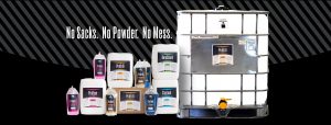
ProAction Fluids is a long-time client that manufactures and blends specialty oilfield and industrial chemicals. Their most recent product, however, makes a complete 180 degree turn and is designed for use by directional drilling operators, rather than industrial oilfield companies. These four different water-based chemicals mix super-easily with water and are much easier (and cleaner!) to use than the traditional large, heavy sacks of powdered chemicals that are currently available on the market. They also offer three sizes of packaging so that operators can purchase just enough for a particular dig, or buy in bulk to service a variety of different digs in different soil types.
As Danielle said, “I’m just amazed that these guys saw a need, saw that they had the right products to fill that need, and have now embarked on an endeavor to package them to sell directly to the consumer — something they’ve never done before! And it’s all done here in Shreveport. No one else in the country is making these additives, much less selling to the retailers who sell and service the drilling equipment and accessories that they’re designed for.”
Richard Creative was tasked with the challenge to create a brand for this new product, which would be implemented in packaging, displays, digital graphics, a new website, and printed marketing materials. We built upon the existing ProAction Fluids logo, adding colors and graphics that complemented the original brand, while distinguishing the new product. We looked to a strong, masculine vibe as seen in a lot of motor-oil and additive products, and then selected a different bold neon color for each of the four related products, so they’ll be easy to differentiate at a glance. The in-store displays will have a light built in to really make the cool colors pop.
We worked closely with their production manager, marketing director, and their president/COO to perfect the brand’s look and ensure the message was clear and accurate. Once we had the brand defined, we coordinated with local photographer Brittany Strickland to capture some great studio images of the product, as well as some on-site photos of the products at work.
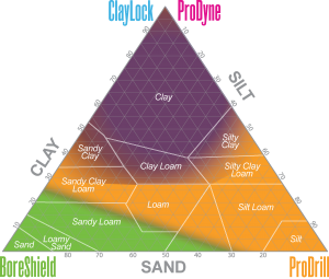 One of our favorite elements of the project was creating the soil triangle graphic for the printed brochure; this graphic is a handy way to educate and assist their clients in selecting the best product combinations for their particular soil type.
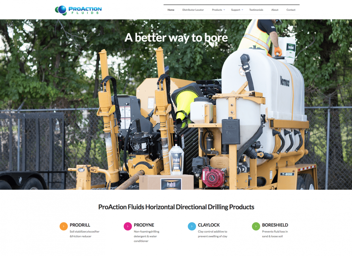
The products and displays will be featured in over 100 retail locations across the country by the end of the year, and you can find more information about the company and their products on their website, proactionfluids.com.
We wish ProAction Fluids every success with this brilliant product!