When it comes to creating a new logo for a company, our goal is to collaborate with the client to design a look that is simple, easily recognized, and unique. We always consider how the logo will be implemented – from signage and large advertisements, to digital placements and small print pieces.
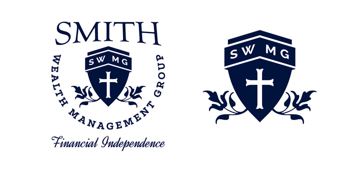
When Anne Smith asked us to design a logo for her business, Smith Wealth Management Group, she had several elements she wanted to incorporate. Anne referenced an old crest that she wanted to emulate, but she also wanted to incorporate a cross or an oak tree. Lauren, our graphic designer on the job, was determined to combine those elements in a way that would clearly communicate Anne’s vision. Lauren says, “The main goal was to create a bold, yet inviting logo for their company – an image that would show strength, as well as reliability and trustworthiness. The shield and leaf elements reflect the company’s abilities to ‘guard’ and ‘grow’ and allow their clients to prosper financially.”
After reviewing several initial mock-ups, Anne chose the winning design and worked with Lauren to customize each detail. As we developed different printed pieces, color variations of the logo were tested, and a royal blue was chosen to add a different dynamic to certain pieces, like her business cards.
Lauren embraced the challenge of this project, saying, “I enjoyed finding a way to take the old style of crest they referenced and give it a simple, modern feel. I like the negative space around the monogram at the top of shield because it makes it stand out, and the leaf elements soften it just enough to add a nurturing quality.”
When Anne received the printed pieces featuring the completed logo, she said that she was “tickled at how great everything looked!”

